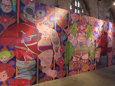
I went to the 20 21 Arts Centre just before Christmas, to pick up an application form for the Open Exhibition which starts later this month. I had a look at this exhibition, it has been there for a couple of months, and is due to finish on the 8th of January. A giant inflatable plus some sculptures and giant computer generated digital pictures.
Jason Wilsher-Mills is the artist. Here is a link to his web site. You might like to browse through my photo's here.


I had a very cold walk this morning. It wasn't too bad when I set out, but it became quite blustery, with some snow which turned to rain. Five miles was enough. I was glad to get back in the house.
Thanks for popping in. We'll catch up soon. Toodle pip. ilona


I agree with you. I'll stick to the Pre-Raphaelites and Impressionists I think.
ReplyDeleteI'll stick with Grayson Perry and David Hockney.
DeleteI think the sculptures and pictures are really scary.
ReplyDeleteThey are for me as well. Like beings from another planet.
DeleteLooks totally weird to me!
ReplyDeleteStrange things go on in artists heads.
DeleteIf I'm correct arent all the exhibits, to do with disability? I have seen the artists work on display at a local cinema.
ReplyDeleteI wouldn't want one on display in my home but they are very interesting and detailed.
Yes, the artist is disabled. I can't make the connection to any disability when I look at his work.
DeleteThey are quirky 😍👌😊😂
ReplyDeleteI like them ilona very cheerful lot's of colours meanqueen your kind of thing mine too 💜💛💚💙
Love Levi x
I love the colours but there is too much detail.
DeleteToo much is too much.
ReplyDeleteMy friend often uses the saying, more is less, when I show her my work and ask her if I should add more detail. True I think.
DeleteNot keen on these Ilona. I don't like nasty looking things and like you say there is just too much to take in. They sort of represent things at the moment with their nasty faces.
ReplyDeleteBriony
x
They have some weird expressions on their faces.
DeleteThey are quirky colourful and a lot of detail. Not my cup of tea either but interesting to look at. We have had a lot a cold wet windy here in Dublin the past 2 days and today has started the same x
ReplyDeleteVery colourful and interesting, but not for me - too unsettling.
ReplyDeleteAmanda, Sussex